KickstartDS Frontend first framework
Our comprehensive component library enables web development teams to create consistent and brand compliant web frontends super efficiently. Easy like squeeeeezing a lemon.

Storybook
npm install @kickstartds/design-system

Button
7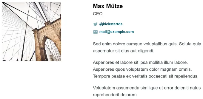
Contact
1
Content Box
3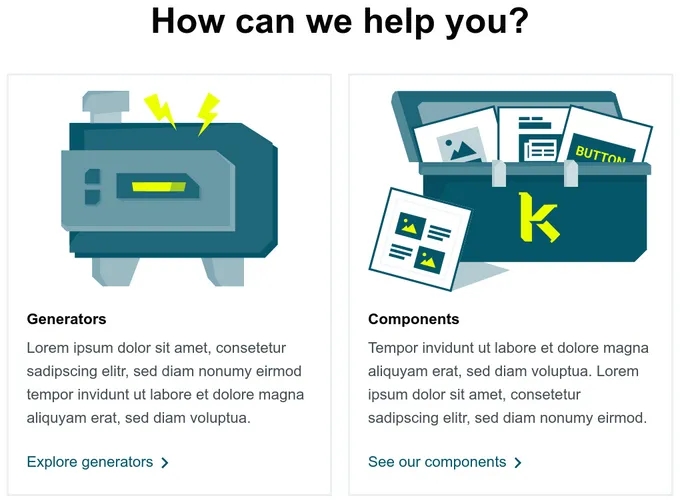
Content Navigation
2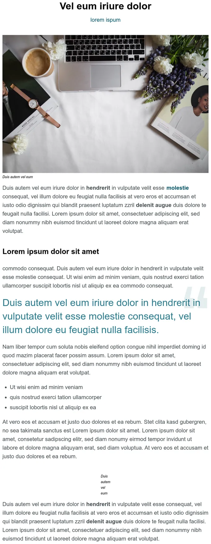
Content Sections
3
Count Up
4
CTA
5
Footer
1
Glossary
1
Header
1
Headline
6
Hero
6
Logos
1
Pages
8
Post Aside
1
Post Head
1
Post Meta
1
Post Share Bar
1
Post Teaser
1
Quote
2Addons in this project
Accessibility
Test component compliance with web accessibility standards
2.4M
Downloads
- + 9
HTML Preview
A Storybook addon that extracts and displays compiled syntax-highlighted HTML
41k
Downloads
- + 5
Storybook Design Token
Storybook addon to display design token documentation generated from your stylesheets and icon files.
20k
Downloads
JSON Schema
Show JSON Schema files associated with components, integrated with Story Controls
401
Downloads
@kickstartds/storybook-addon-component-tokens
Interact with css component tokens dynamically in the Storybook UI
5
Downloads


